

3. Plant Walk

This blog post is stepping away from lines in books for a moment, and will instead cover my process for making my illustration ‘Plant Walk’. This piece was created for an illustration prompt set by my agency, T2, for Take your houseplant for a walk day. These monthly prompts are such a good way to get the brain ticking, challenging you to communicate a creative solution through playful illustration. Luckily (& rarely) this piece was relatively straightforward and I had no major bumps in the road! Let’s get into it!
The Line.
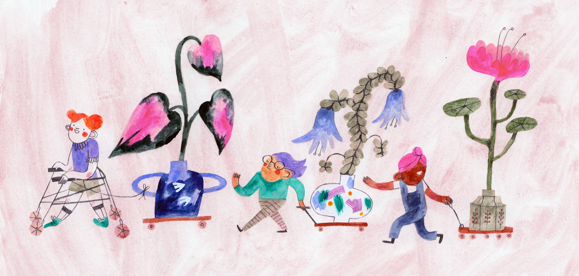
Take your houseplant for a walk day!
These are the things I wanted;
Playful dynamic movement
Inclusivity of disability/neurodiversity
A bright highlight colour
Massive plants with cute detail! (I am fond of making my work very magical and not as communicative as it should be, so I scaled back the idea of having the plants actually walking themselves, and decided making them giant with lovely pots and vases was a good compromise).
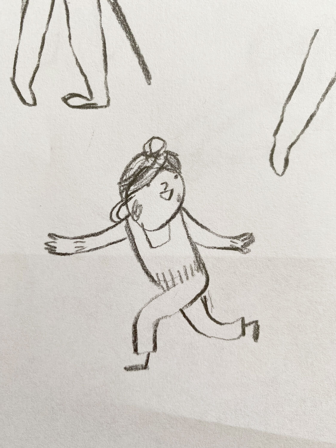
The Wobbly Lines (Sketches).
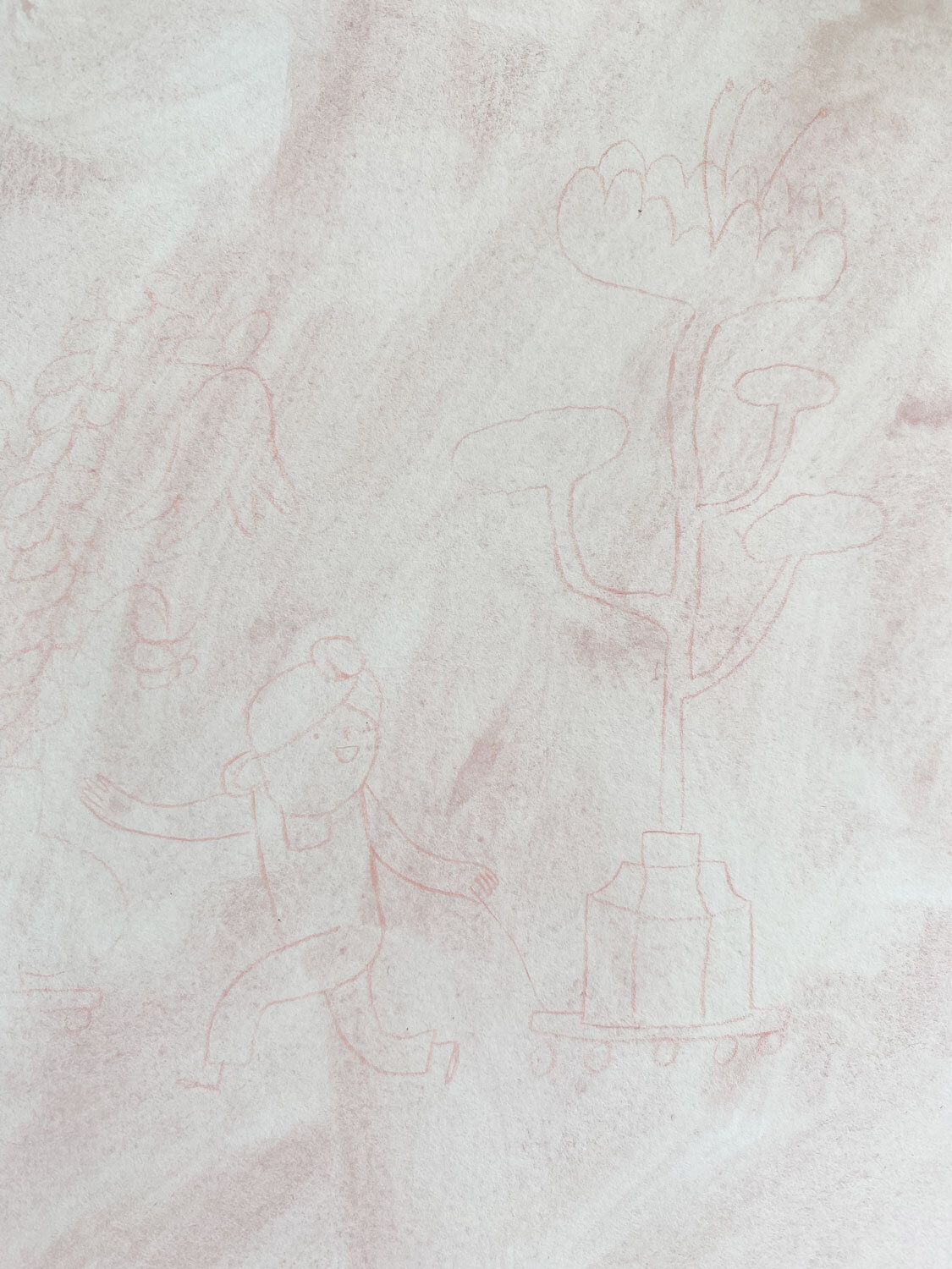
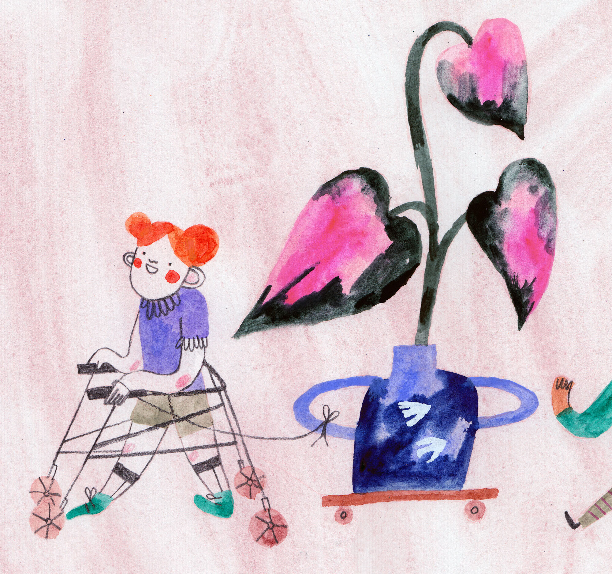
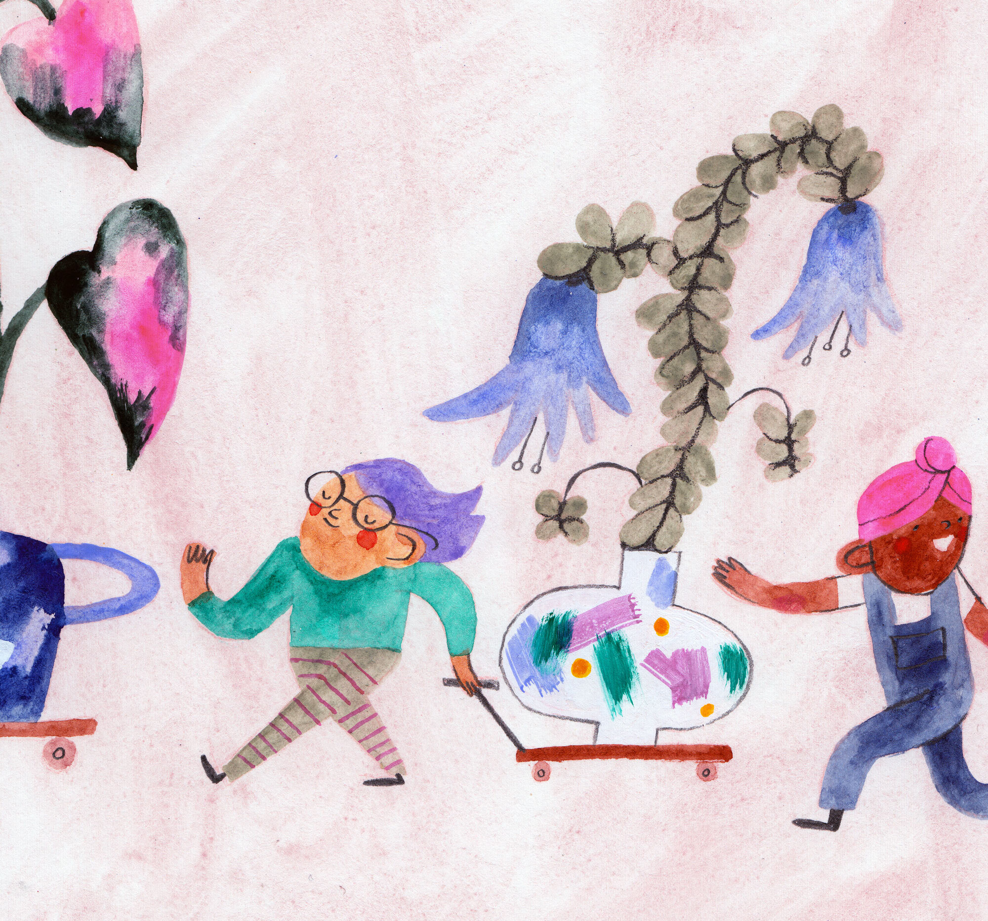
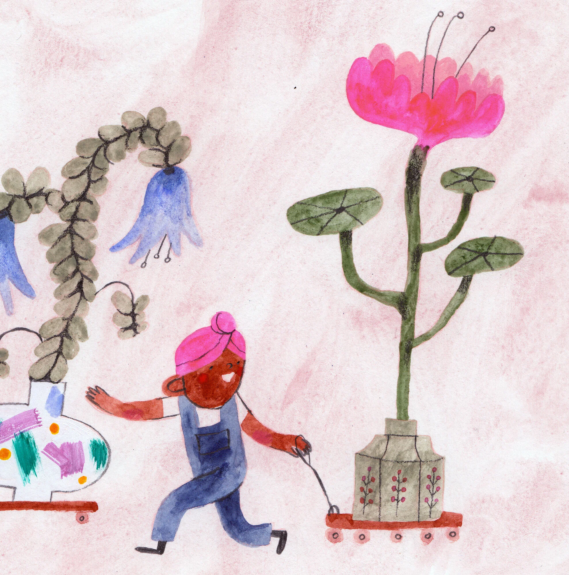
I started this piece by sketching out some little characters walking, of mixed abilities. Concerned that the idea of ‘walking’ might limit options for neurodiverse and/or disabled children I knew I wanted to make this piece inclusive. After about 30 minutes or so of sketching lots of little characters (some not so good, as you might see in the margins!), these 3 jumped out of my pencil and caught my eye.
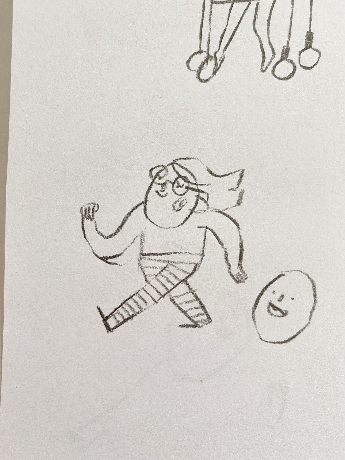
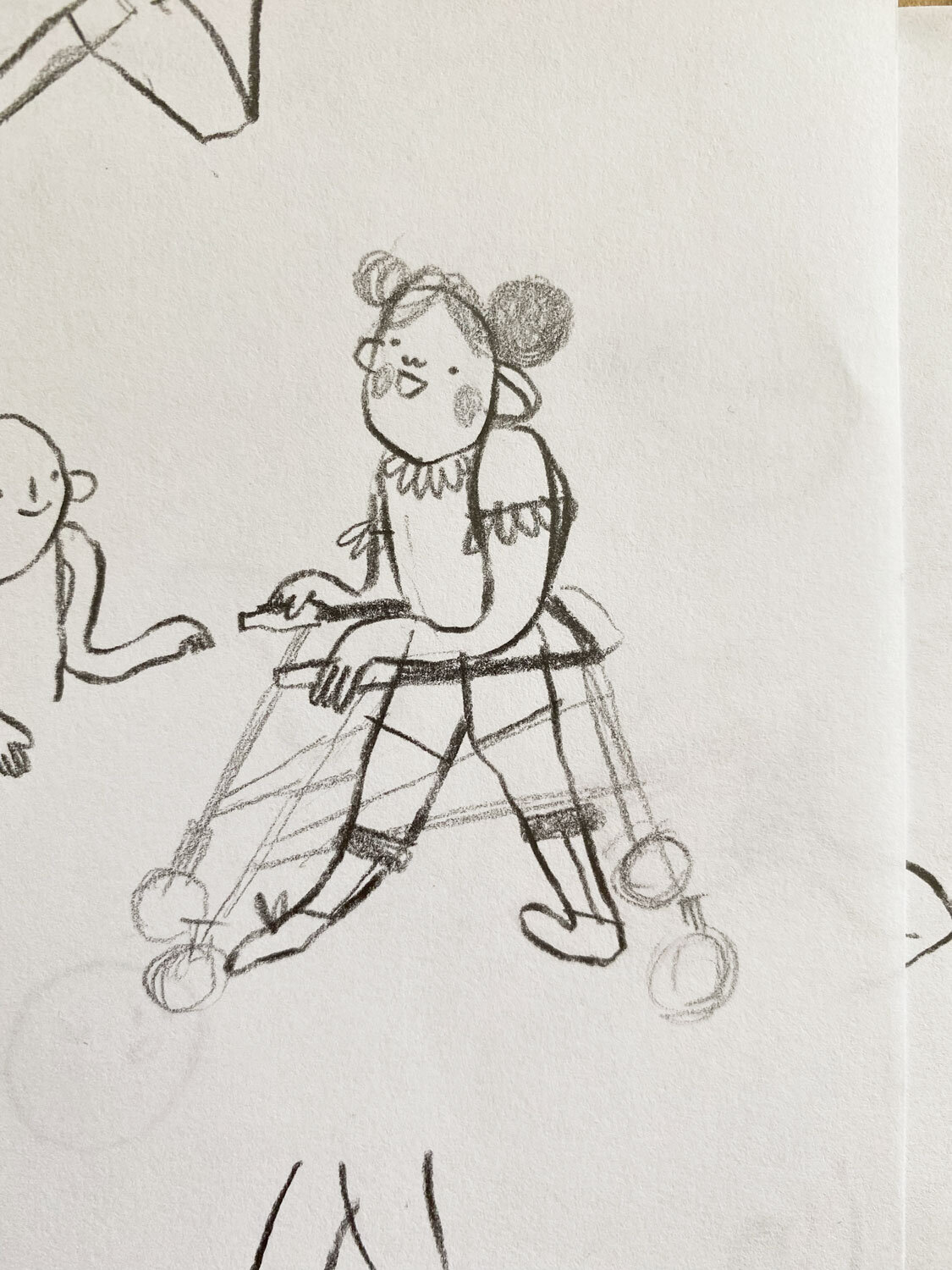
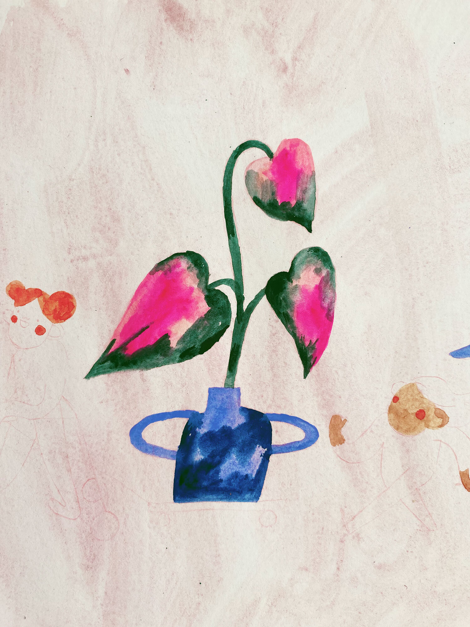
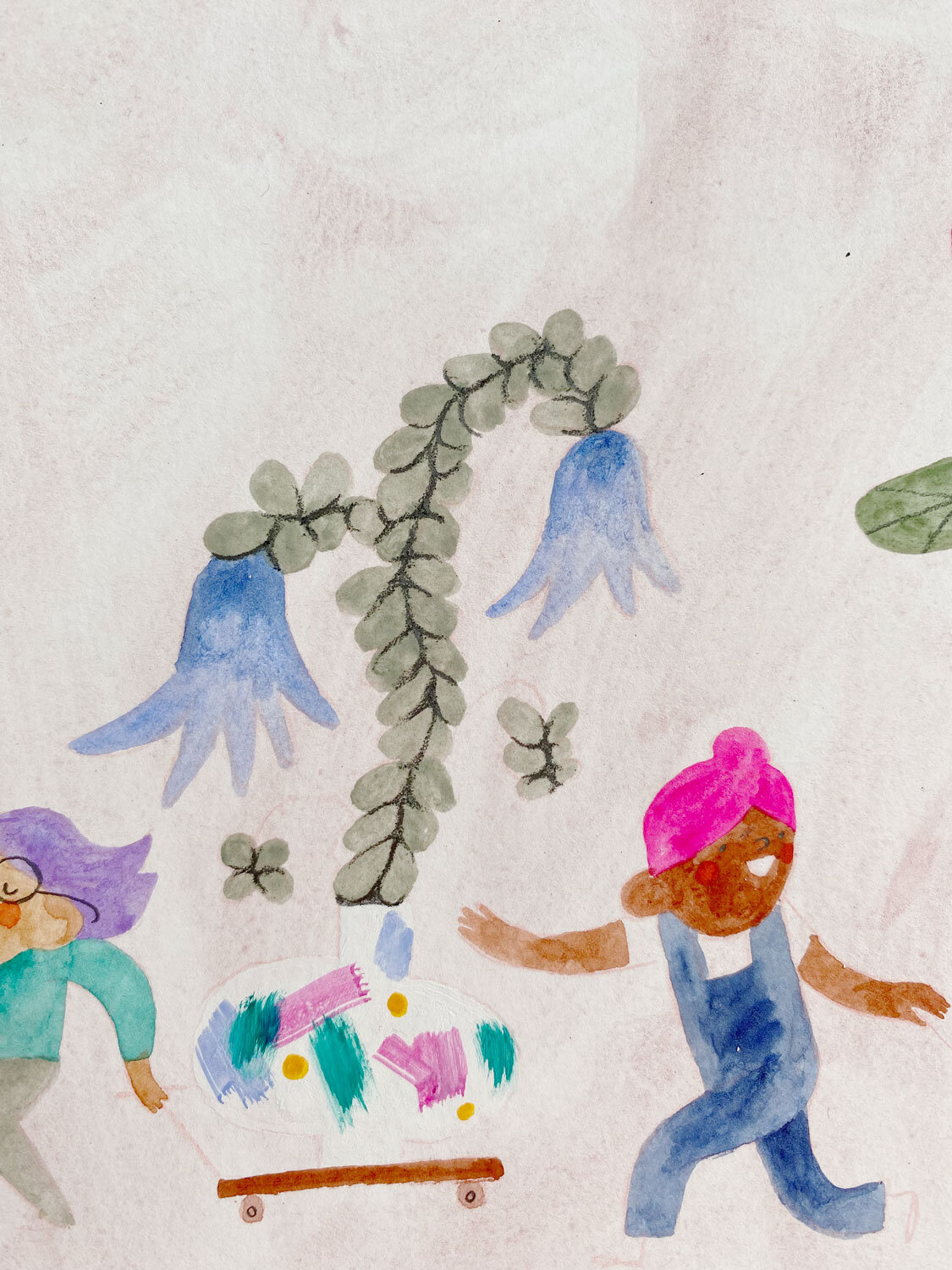
Characters found! Next it was onto the plants that needed walking. I knew I wanted some bright highlight colours so looked up plants that matched what I was going for. I chose a princess philodendron, a succulent type plant with flowers (I made this up!), and also another creation based on two of my favourite plant leaves - chinese money plants and nasturtium.
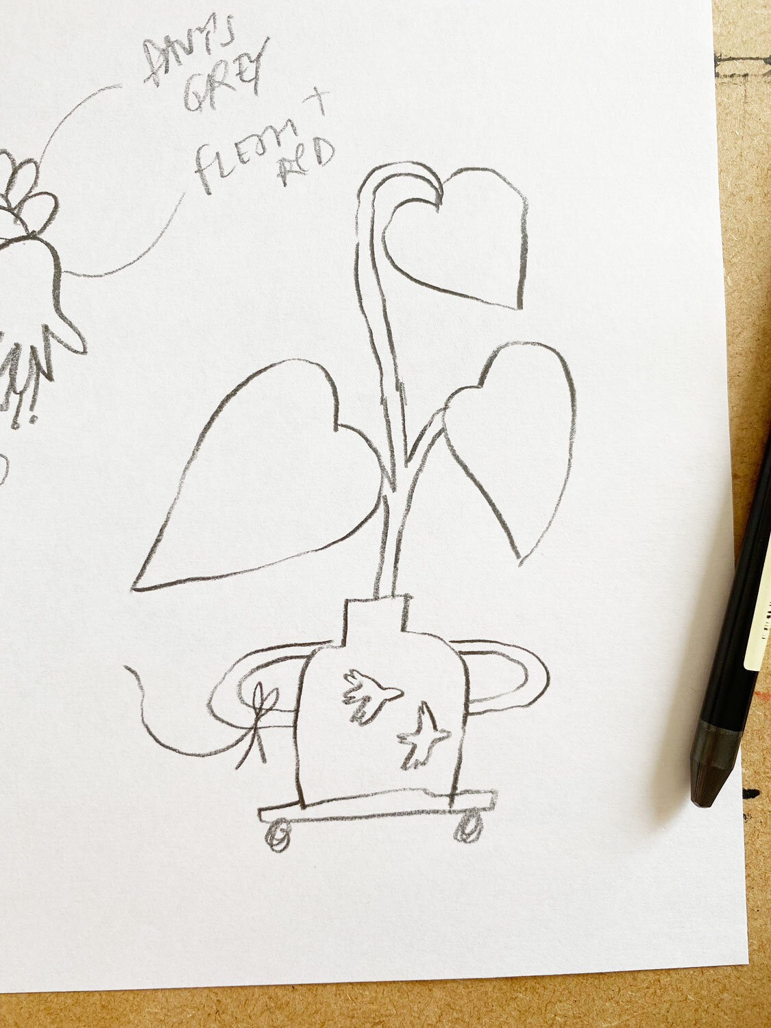
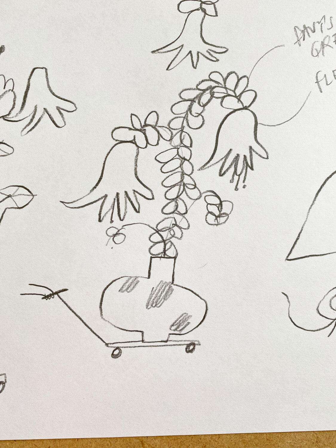
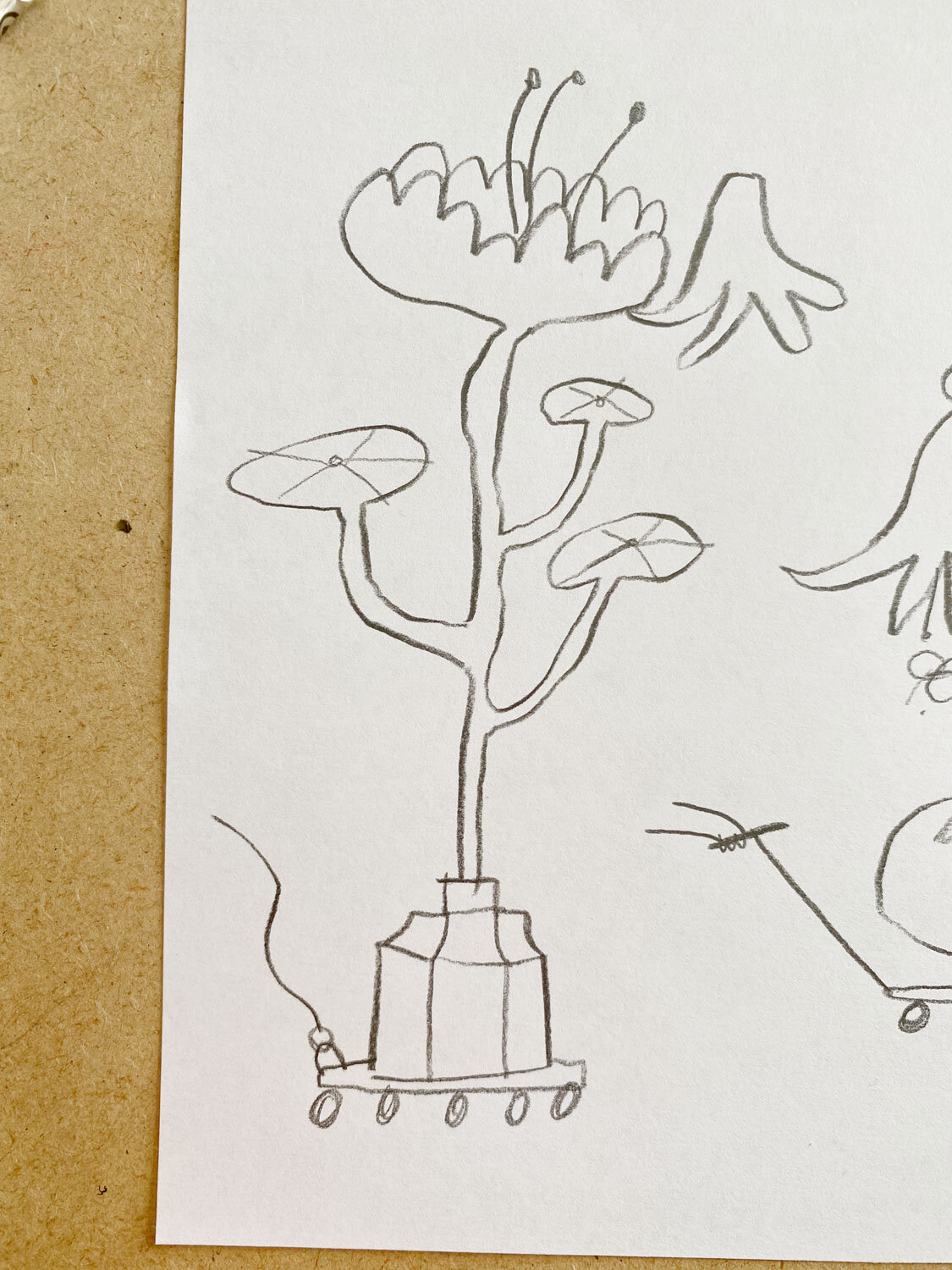
Sketches done! Unfortunately, they were all over the shop, on different pages and surrounded by other sketchy bits I didn’t want. So I scanned them all in, and did a digital cut and paste collage job! A no doubt long winded and time consuming way of doing this but hey ho! Here’s the composition I went for…

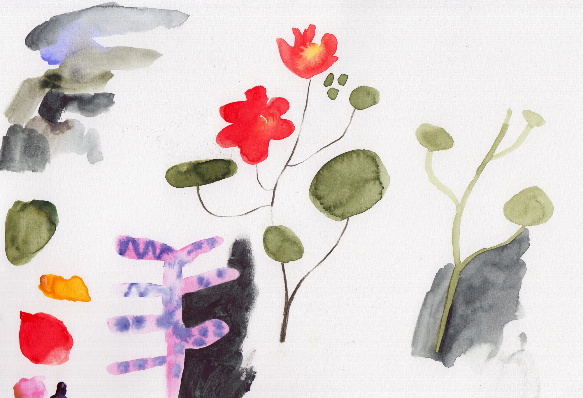
The Messy Bit (Painting).
I started with playing around with colours, seeing how the dark green and the vibrant pink of the princess philodendron would mix together. I was chuffed with this result and knew it would work. For this piece I used watercolour. I went with my recent favourite background wash (Schminke Potters Pink), earthy tones (Schminke Green Earth, Winsor & Newton Davy’s Grey, Winsor & Newton Perylene Green, Imidazolone Brown), and blues and purples (my favourite Schminke Delft Blue, Holbein Lavender), and highlight colours (Holbein Opera, Schminke Phthalo Green, Schminke Cadmium Red Light) - I also used Holbein Shell Pink to blend out the pink in the philodendron leaves!

Colours selected and tested, I washed my paper with my Potters Pink wash and once dry, I very gently drew the outline of my sketch using a coloured pencil and my lightbox.
As ever, I start with block shapes before I go anywhere near wobbly lines or details. I have no real rhyme or reason to what I paint first. If I ever have yellow in an illustration which is rare, I’ll always start with that first as I feel like it gets muddy/contaminated by other paint so easily. However, for this one I just went with what was closest!
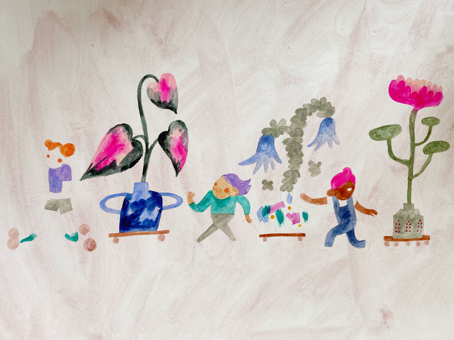
Once the colourful blobs were done, I started adding some detail to the vases. And then I sat for about an hour just staring at it thinking, should I paint a dark background? Or should I just introduce linework to outline everything? This is a tricky one for me because I LOVE linework in my sketches, but with paint I am not such a fan. Something about it containing the free feeling of the paint? After getting some eyes on it (Ed & my sister), I opted for linework. In order to make it less stark, I chose my trusty 9B graphite pencil.
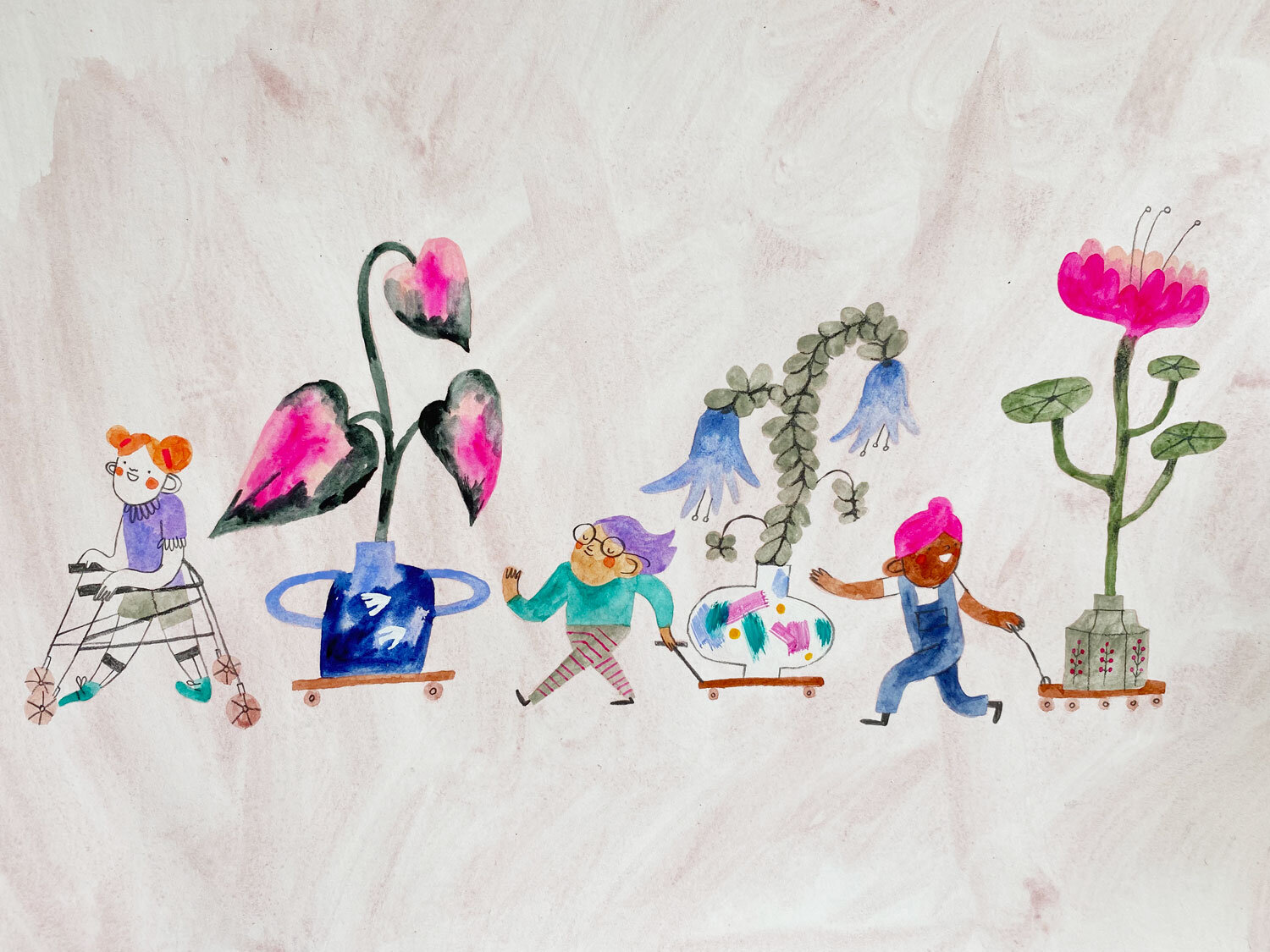
And there we have it! But it wasn’t over yet… One minor hiccup I did encounter was when I scanned it in, the vibrancy of the pink didn’t translate (which I should have known after scanning a previous fluoro pink before). So, in photoshop I had to touch these highlights up to match the original as close as possible.
And there we go! Another nonsensical painting process for you. I’d love to know if you follow any of these techniques and processes (if you can call them that). Thank you for reading, and I’ll see you next time!
Big love,
JB